


The paint companies have revealed their picks for 2014, and there’s one overriding message: Let the sun shine in.
“Last year, it was all about shutting off, of wanting to escape from the hectic pace of life in our homes – but now we are feeling again that we can express ourselves in a bit more creative ways than in the past,” observes Martin Tustin-Fuchs of Dulux. Certainly, 2014’s colours show a new sense of assertiveness and personality not seen in the last couple of years, allowing you to create a personal statement simply by repainting your walls.
From buttery yellows to fresh blues, complex pinks, and neutrals that are much more interesting than your basic, safe, boring beige and tepid taupe, many of the shades of 2014 are purposely selected for their liveability. While there are some bright and unexpected shades sprinkled across most manufacturers’ palettes, for the most part these are colours chosen to let neutral-weary Canadians welcome colour back into their homes without going into shock.
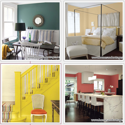
Two top picks of the year, Breath of Fresh Air (806) by Benjamin Moore and Creamy (50YY-77/285) by CIL, are both splendid examples of shades that are anything but neutral, yet fresh and easy to live with.
“Yellow in many ways behaves like a neutral, in that it goes with everything,” says CIL’s Alison Goldman. “And Creamy is a great yellow for anywhere in the home, because it sits right on the border between too acid and too creamy.” Yellow is also predicted to be a strong colour in accents and accessories; two of Sico’s offerings, Bunch O’Bananas (6096-54) and Citrus (6098-54) are a little more assertive. While either shade would look stunning in a room furnished with rich-toned furniture and colourful artwork, some home decorators might find them more appealing used in smaller doses, such as painted furniture or on an accent wall.
Benjamin Moore’s Breath of Fresh Air comes from the opposite spectrum of the colour wheel, a fresh sky blue that is equally at home in bedroom, bathrooms or living rooms.
Pinks and corals are a trend increase for 2014 as well, but the best ones are neither too sweet nor too muted. Dulux’s Tender Rose (#50) has orange and earthy undertones to it, adding sophistication and broadening appeal; from bathrooms and bedrooms to hallways, dining rooms and even living rooms. Other interesting, complex pinks include Sico’s Palace of the Winds (6060-31), CIL’s Salmon Pink (60YR-59/261) and Behr’s Minuet Rose (T14-15), each infused with drama that’s anything but girlish.
Even this year’s neutrals have a complexity that makes them interesting as backdrops to brighter accents, paired with more colourful paint shades, or with pastel-coloured upholstery (which was an important message in the Milan and High Point furniture shows last summer). CIL’s Chinchilla White (10YY-46/041) is a taupey grey that has a chameleon quality to it, according to Goldman. Paired with a clearer colour like Creamy, it adds a presence that grounds the sweetness of the yellow; paint the trim crisp white, and it behaves like a colour all on its own. Other neutrals contain a hint of romance and nostalgia, such as Benjamin Moore’s Castleton Mist (HC-1) – a mustardy taupe, or Dulux’s Tibet Tan (70YR 45/133) – a rich clear mocha.
Several companies present their annual picks in groupings to make it easier for consumers to create cohesive looks around the shades, or to use different colours in combination without fear of making a mistake. Behr’s website is a good place to start for colour groupings that pair well together, and for design and theme inspirations. Its four groups for 2014 – Urban Alternative, Natural Avocation, Seaside Harmony, and Grand Reign – each represent a distinct theme that you can complete with accessories, furnishings and art. For example, Urban Alternative, according to Behr’s Nancy Bollefer, works very well in open concept homes or condos where more than one room is visible at a time.
“It has a rustic, earthy, authentic feeling,” says Bollefer. “It’s designed to celebrate craftsmanship, an integration of different materials, and an artisanal, made-from-scratch feeling.” The palette, says Bollefer, is particularly appealing to young men, since it’s quite neutral in tone, rich and complex, with a classic feeling designed to outlast fleeting trends.
Other groupings in Behr’s palette include Natural Avocation, evoking the world of natural history and science, with mounted butterflies and framed bird pints, polished brass and leatherbound books. At the other end of the spectrum is Seaside Harmony, a cool, sophisticated update of the coastal look, with washed out neutrals like South peach, a near-white with just a breath of pink, and Ocean Liner, a clear aqua blue. “These two shades together have a retro, Miami Vice mood that’s popular with younger people right now,” says Bollefer. The final group, Grand Reign, is inspired by the film Anna Karenina, with opulently rich colours like Coronation (T14-12) a gold that in certain sheens, can gleam like a metallic.
Many of the 2014 colours inspire new, creative ways to bring in colour that go beyond the expected. “Try painting a staircase not in typical neutrals, but in a yellow like May Yellow, then add a colourful runner,” suggests Tustin-Fuchs. “There are many ways to use colour in smaller ways. Again, it’s all about using your home as a means of personal expression.”